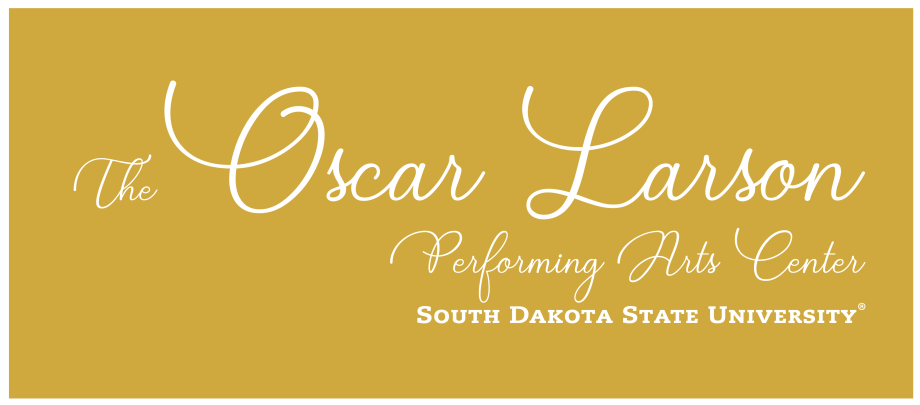
Branding Guide
Approvals
Stakeholders are required to submit their marketing materials for approval two weeks prior to printing and distribution. All marketing materials must adhere to the Oscar Larson Performing Arts Center brand standards. Request for approvals must be emailed.
Branding Toolbox with
Logo Marks
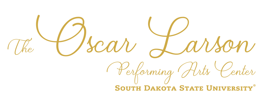
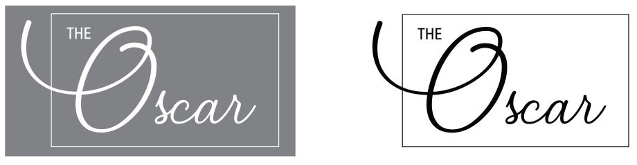
Primary Identity Mark
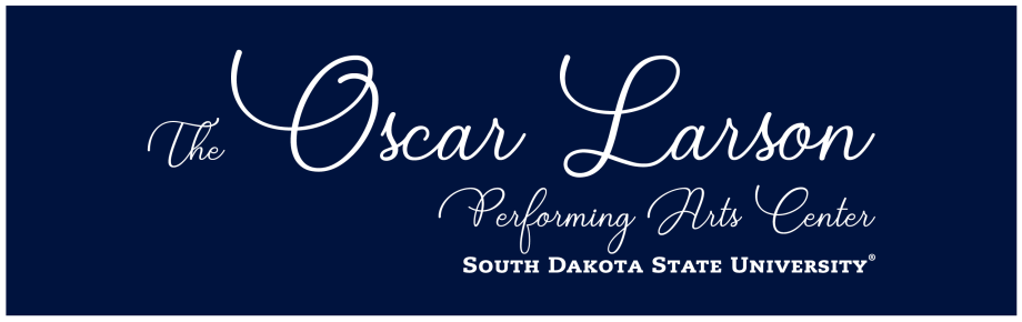
* Blue is only shown as a background color example.

Secondary Identity Mark


Tertiary Identity Mark


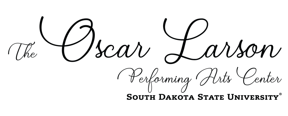
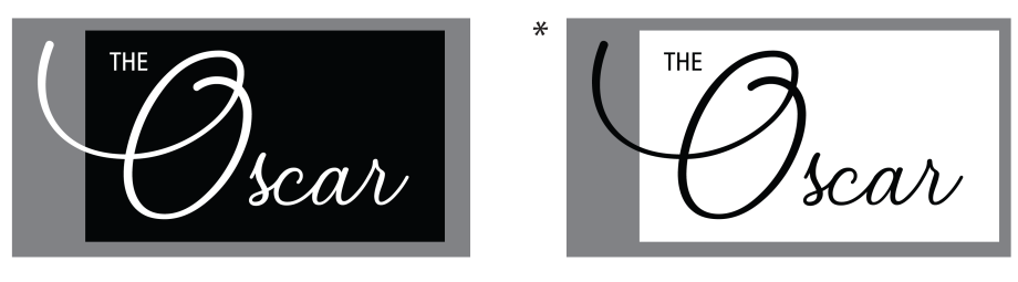
Black and White Logos
Black and white versions of the logo will primarily be reserved for ‘back of house’ purposes, but there may be use cases where a vendor will require a black or white version of the logo.
Primary Identity Mark
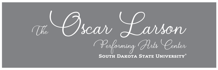
* Grey is only shown as a background color example.
Secondary Identity Mark

Tertiary Identity Mark

Guidelines
- Logos should always be represented no smaller than 1” in height or width, whichever is greater.
- Minimum 3/16” of clear space on all sides must be left between the logo and any other element.
How to Use Logo
Primary Logo
The PRIMARY LOGO should always be placed on a one-color, high contrasting / nonpatterned background.
Correct Use
good contrast between background and logo
good contrast between background and logo
Incorrect Use
patterned background
poor contrast between logo and background
Secondary Logo
The SECONDARY LOGO can be used as a design element on marketing materials but the Primary logo should also be represented somewhere on the material.
Correct Use
Secondary logo is used as a design element at the top of the poster but the Primary is also included.
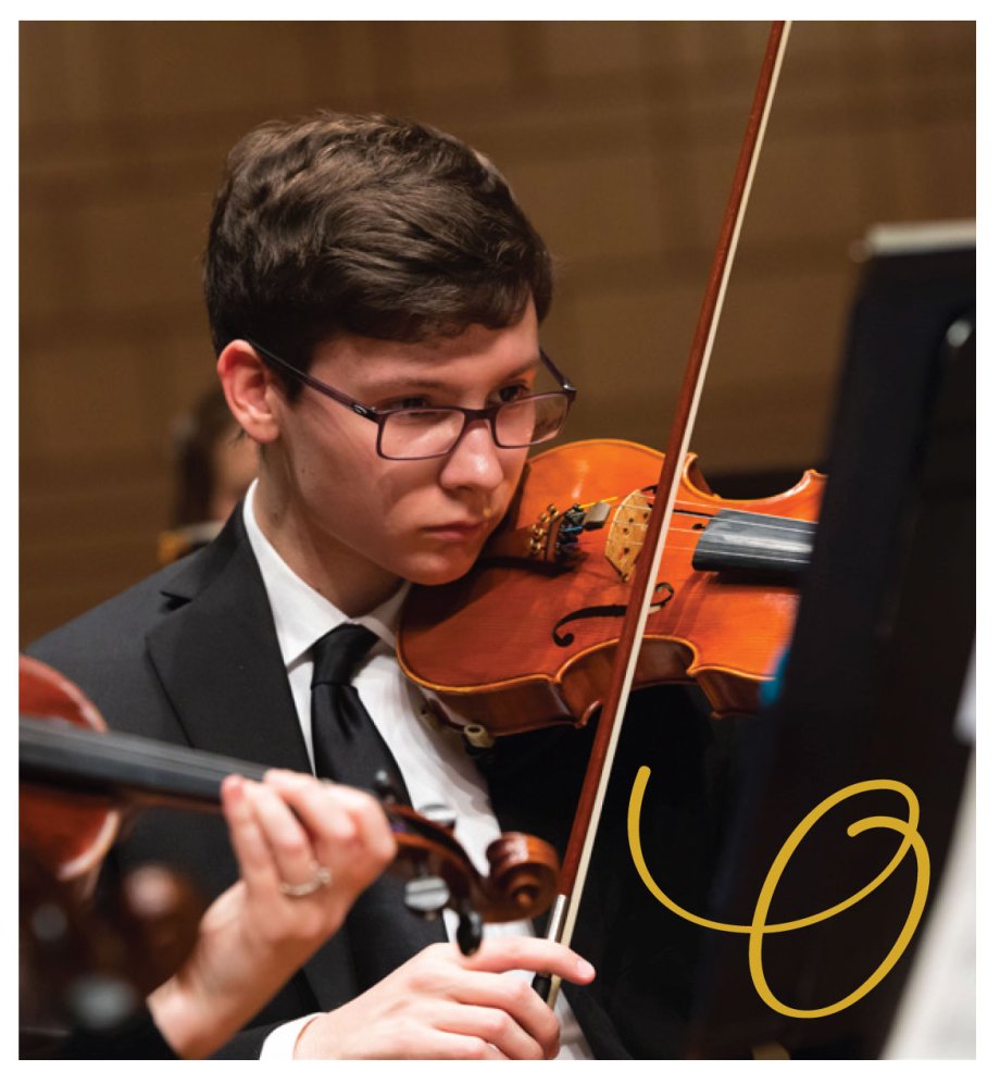
Tertiary Logo
The TERTIARY LOGO can be used over photos but should be placed in a way that doesn’t obscure the photo. Never place the ‘O’ over faces in photos.
Correct Use
Correct Use
Incorrect Use
Secondary and Tertiary Logos
The SECONDARY LOGO and TERTIARY LOGOS both contain ‘color block options’, as seen below. When using these options, the logo should be placed on a high contrast background so both the text and color block of the logo are clearly visible and separate from the background.
Correct Use
good contrast between background and logo text/color block
Incorrect Use
poor contrast between background and logo text/color block
Colors
PMS 117 | PMS 289 | PMS 2706 | 0C–0M–0Y–0K | 75C–67M–97Y–90K |
Preferred Fonts
Minion Std

Minion Pro

Futura

Futura PT

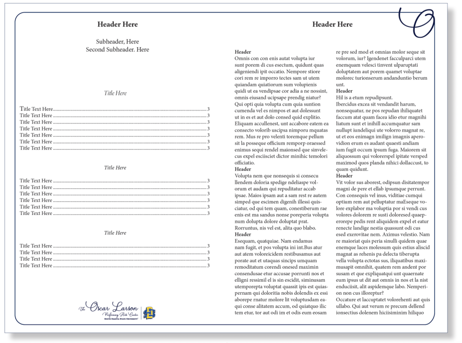
Framing Treatment
This framing treatment can be used as a branding signature for various applications. Rules for the ‘O’ frame:
- The ‘O’ should only be placed in either the bottom left corner or the top right corner. This placement allows for the ‘O’ to be placed in such a way that it blends seamlessly with the framing element.
- The frame should always have rounded corners. The radius of the corners may vary depending on the size and shape of the frame.
- The frame can be a square or rectangle.
- When the ‘O’ is placed in the top right corner you need to ‘cut out’ a small piece of the frame that intersects the ‘O’.
NOTE: Small piece of frame ‘cut out’ of ‘O’ placed in upper right corner.
Framing Treatment Examples
POSTCARD
INSIDE OF PROGRAM
Co-Branding
SDSU-Affiliated
When branding for the School of Performing Arts or other SDSU-affiliated events the branding should reflect 80% SDSU brand standards and 20% Oscar Larson Performing Arts Center brand standards. Examples: Use the SDSU primary brand colors for 80% of the design. Using The Oscar framing treatment is allowed but not required. The primary logo is the SDSU-affiliated logo and the secondary logo is The Oscar logo. The hierarchy of logos is established by the primary logo being a bit larger than the secondary and the primary logo is always on the left or top while the secondary logo is to the right or on the bottom.
PROGRAM EXAMPLE
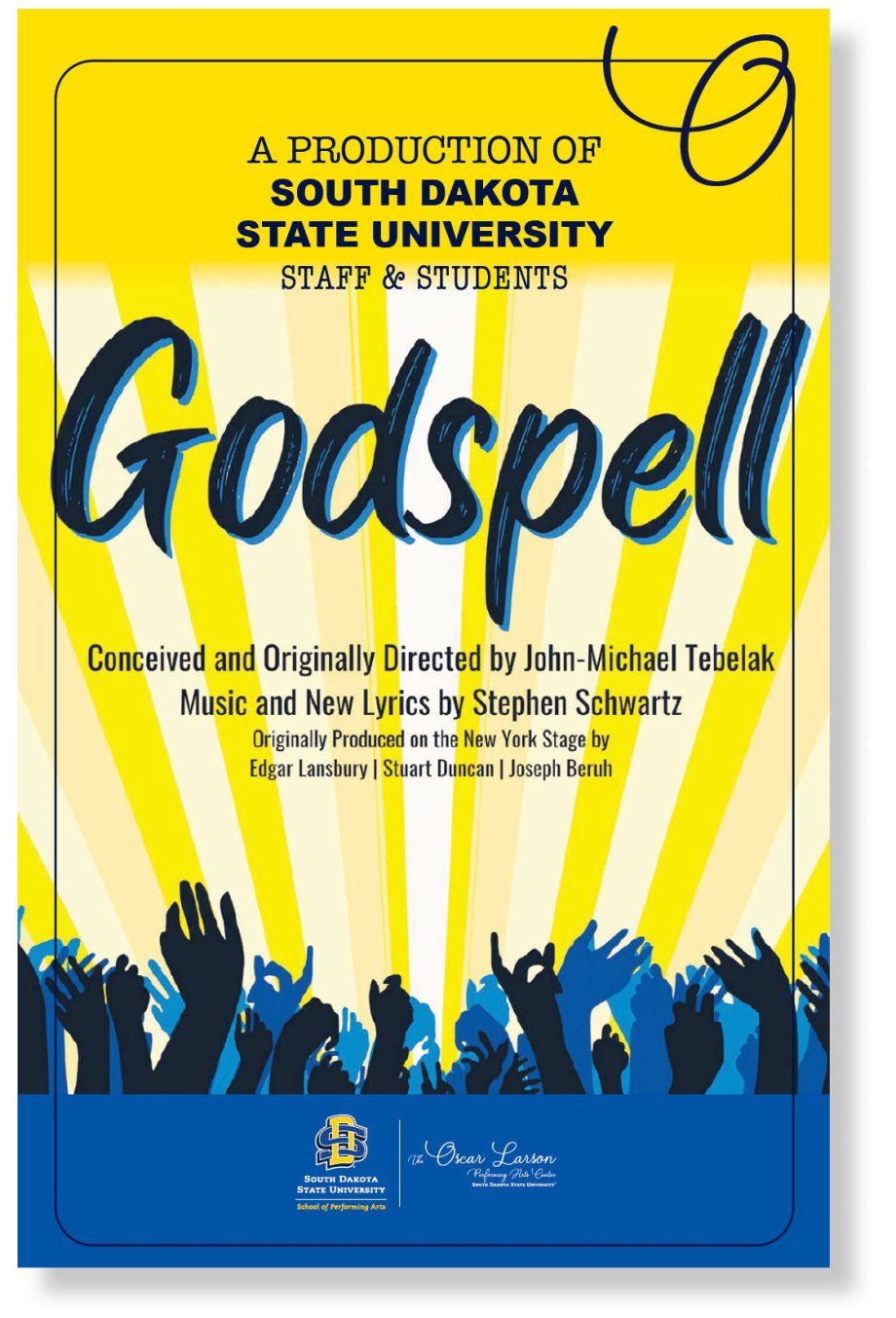
POSTER EXAMPLE
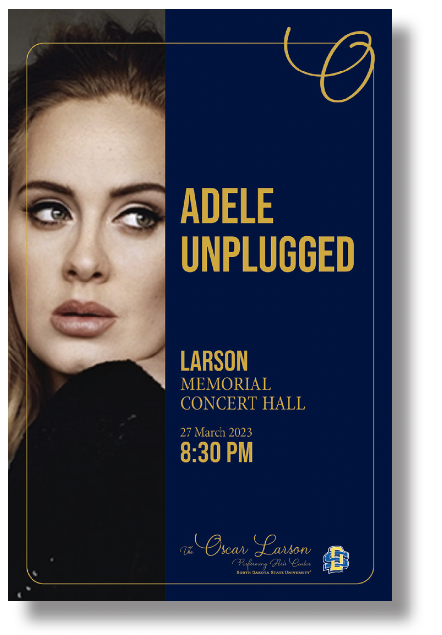
NON SDSU-AFFILIATED
When creating marketing materials for non SDSU-affiliated events the branding should reflect 80% personal brand standards and 20% The Oscar Larson Performing Arts Center brand standards. Of that 20%, choices can be made in including our primary logo, along with a secondary or tertiary logo. The hierarchy of logos is established by the primary logo being a bit larger than the secondary and the primary logo is always on the left or top while the secondary logo is to the right or on the bottom (see examples below).
Other examples of meeting the 20%: using The Oscar framing treatment (optional to use in other approved colors like black and white), using a combo of The Oscar logo and brand colors throughout the design, or using a combo of The Oscar primary and secondary/tertiary logos. If you have any questions regarding branding and promotion, please reach out to us at sdsu.OLPAC@sdstate.edu.
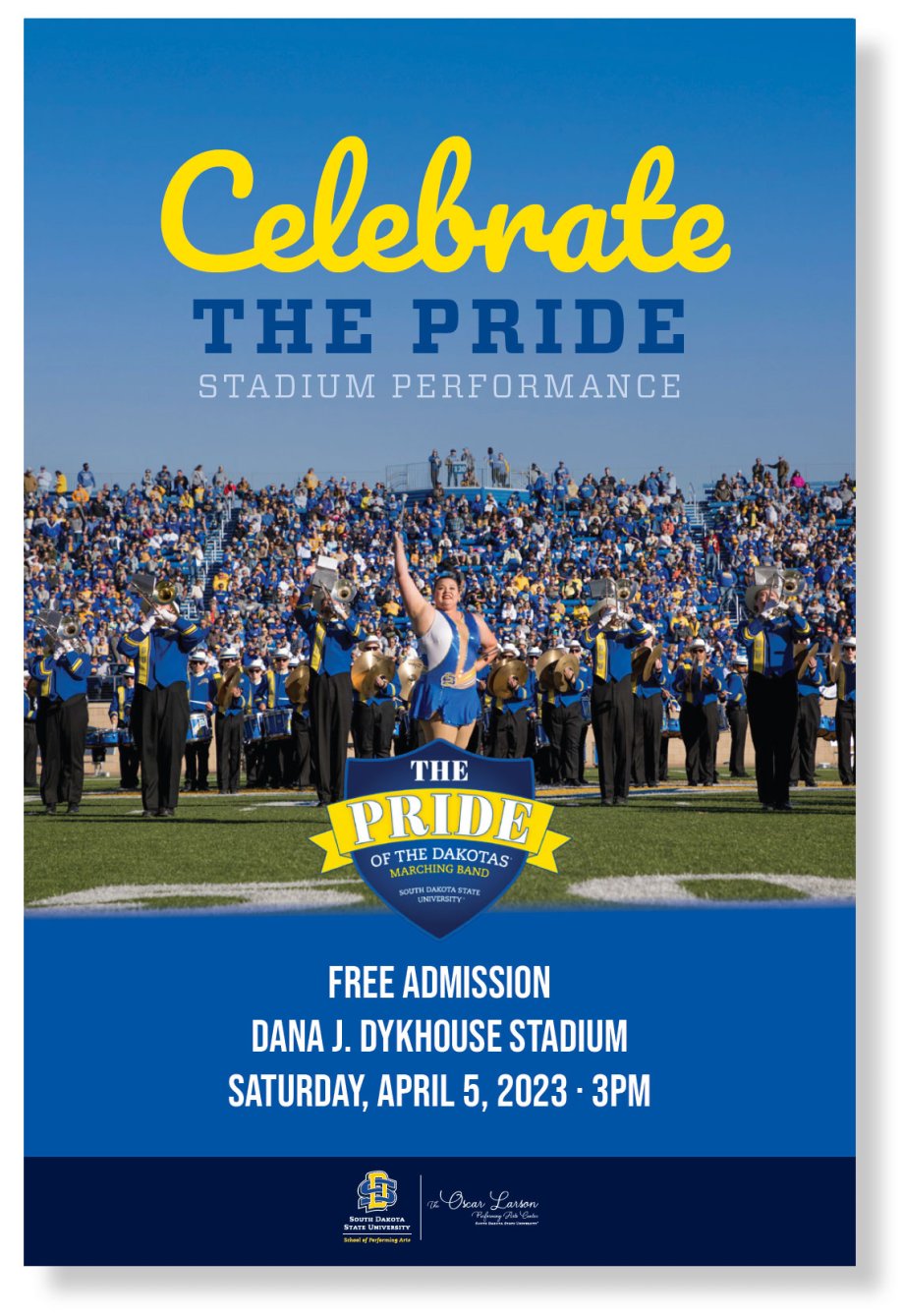
OSCAR LARSON PERFORMING ARTS CENTER
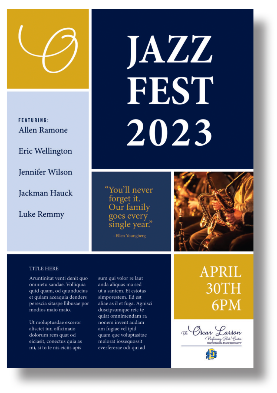
When branding for The Oscar Larson Performing Arts Center hosted events the branding should reflect 80% The Oscar Larson Performing Arts Center brand standards and 20% SDSU brand standards. Examples: Use The Oscar brand colors for most of the design, an exception would be using a shade of tint or The Oscar brand colors. Do not use SDSU Blue or SDSU Yellow. Using The Oscar framing treatment is allowed but not required. The primary logo is The Oscar logo and the secondary logo is the SDSU logo. The hierarchy of logos is established by the primary logo being a bit larger than the secondary and the primary logo is always on the left or top while the secondary logo is to the right or on the bottom.
PROGRAM EXAMPLE
POSTER EXAMPLE
Contact
• Email: sdsu.OLPAC@sdstate.edu
• Phone: 605-688-5188